

Lies, Damned Lies, and Statistics
Lies, Damned Lies, and Statistics
Correct numbers, wrong conclusions

When pharmaceutical companies have their hands on a promising new vaccine, they put an inordinate amount of effort into answering a simple question: does it work? While there’s also a critical need to understand the vaccine’s side effects and safety profile, the question of efficacy is the main driver behind clinical trials.
The gold standard process in which efficacy is determined is the randomized double-blind, placebo-controlled clinical trial. In it, a portion of trial participants are randomly given the treatment while others are given a placebo. Those evaluating patient outcomes are blind to whether the participant received the vaccine or the placebo.
Given the amount of time and money that goes into R&D and conducting such trials, completion of a successful test can be a BFD for a pharmaceutical company. The pharma company’s marketing engine will kick into high gear to spread the positive news, usually with an immediate press release touting the vaccine’s effectiveness. Just Google “vaccine clinical trial efficacy” to see the latest and greatest from busy pharma marketing bees. Exhibit A:

84% effective. Kewl.
Despite the promise of headlines like this, we never jump to conclusions after seeing simple statistics. Our response is always to dig in more.

“84% effective” might be factually correct, but it doesn’t provide context as it’s only referring to relative risk, not absolute risk. Relative risk tells you the risk reduction relative to taking a placebo. To understand the full picture, you need to understand absolute risk.
For example, what if the risk of contracting the disease was 1 out of 20,000, or 0.005%? That would mean that a vaccine with 84% relative efficacy would reduce a 0.005% risk to 0.0008%. A very small number becomes an even smaller number.
Does that mean that the vaccine is useless? Definitely not. What if the mortality rate was very high?
We could go on, but our intention here isn’t to go down a vaccine rabbit hole, our point is that simple statistics can be true and misleading at the same time. They give you one piece of information, but they’re telling you a small sliver of the story.

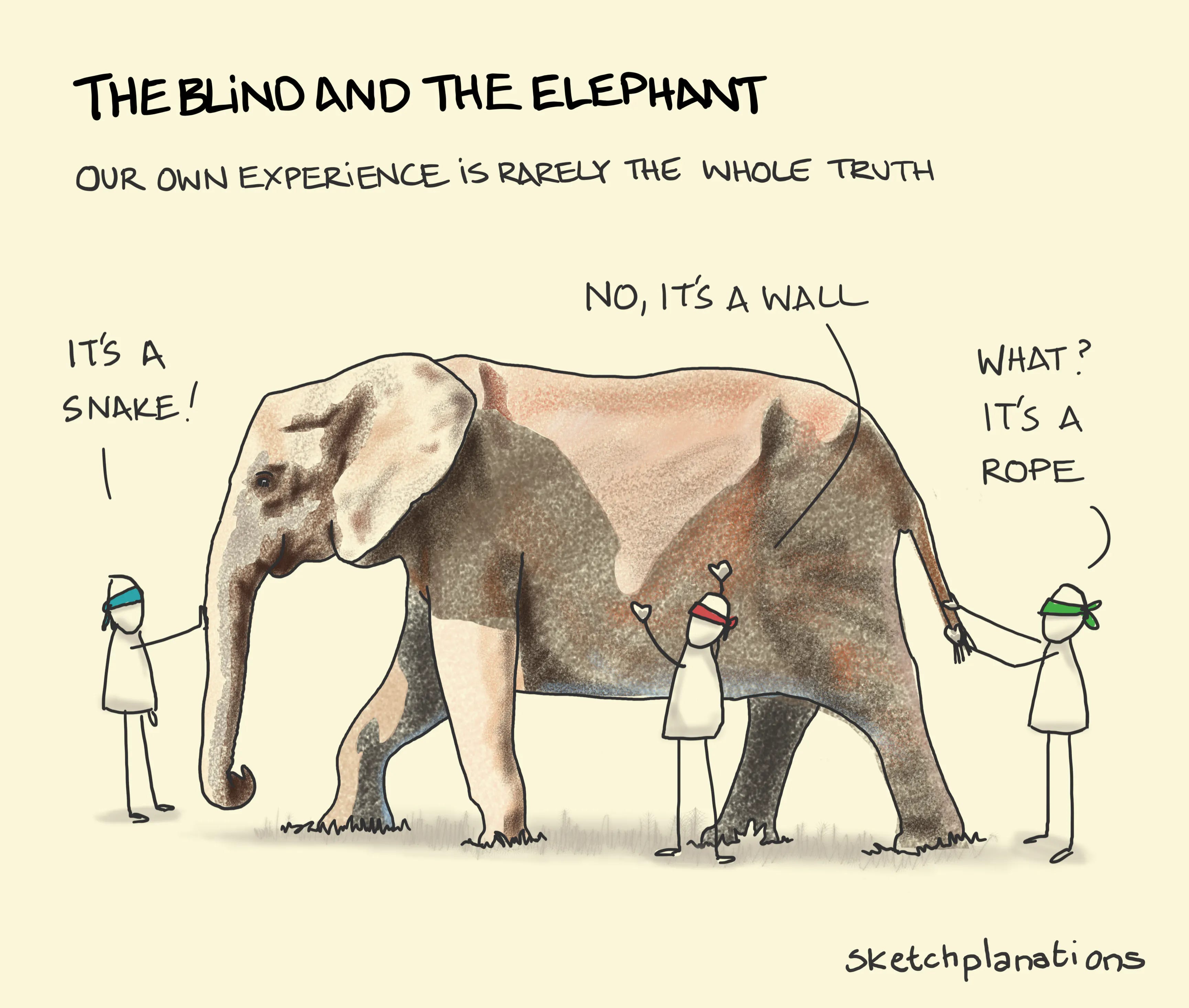
If you don’t dig in more, your understanding will be surface-level and your conclusions will be illogical - similar to the blind men and the elephant parable.
Seductive, simple statistics are used over and over again when describing climate change and the energy transition. They’re usually true and almost always packaged with implied (and incorrect) conclusions. We’ll give you two quick examples, but once you create the “dig in more” habit you’ll begin seeing misleading climate and energy stats everywhere you look.
Example 1: 97% of climate scientists agree that climate change is real and human-caused
Implied conclusion: the science is settled and all experts agree that climate change will be catastrophic unless we take drastic action to reduce fossil fuel usage
This is an oldie but a goodie. We’re starting here as this is perhaps the most infamous statistic that has created a religion of climatism in which “climate action” is promoted at all costs and those questioning said action are swiftly categorized as “deniers.”
The origin and validity of the 97% figure isn’t the primary subject of this piece. Our goal is to simply describe how "true” statistics can lead to untrue conclusions. However, we’d be remiss not to give you a brief explanation.
The infamous “97%” was, as even noted on NASA’s website, popularized primarily by two papers: Oreskes 2004 and Cook et al. 2013. Here’s a snippet from the abstract from Cook et al. (the more influential research):
“We analyze the evolution of the scientific consensus on anthropogenic global warming (AGW) in the peer-reviewed scientific literature, examining 11 944 climate abstracts from 1991–2011 matching the topics 'global climate change' or 'global warming'. We find that 66.4% of abstracts expressed no position on AGW, 32.6% endorsed AGW, 0.7% rejected AGW and 0.3% were uncertain about the cause of global warming. Among abstracts expressing a position on AGW, 97.1% endorsed the consensus position that humans are causing global warming.”
A summary for us simpletons:
They looked at the abstract section of 11,944 climate research papers
Of those, 33.6% or ~4,013 expressed a position on whether global warming had a relationship with human activity
Of those 4,013 papers, 97% endorsed the “consensus position” that humans are causing global warming
What exactly is the “consensus position” you ask?
“We examined a large sample of the scientific literature on global [climate change], published over a 21 year period, in order to determine the level of scientific consensus that human activity is very likely causing most of the current GW (anthropogenic global warming, or AGW).”
The purpose of Cook et al. was to make the point that the majority of climate scientists agree that global warming is happening and that human activity is “very likely” causing “most” of the current warming. That’s it. The paper doesn’t say anything about the magnitude or severity of climate change, how much humans are influencing the change (50%? 90%?), or anything about what actions, if any, should be taken.
Instead of accurately representing the 97% statistic, politicians and reporters alike took it and twisted it.
Here’s Obama throwing in “dangerous” out of nowhere in 2013 only to retract it in 2016:


“97% of climate scientists agree that humans are very likely causing most of the warming” became “scientists agree that global warming is code red for humanity and we must get rid of fossil fuels.” Isn’t it ironic that politicians and reporters were misrepresenting “The Science” when they were purporting to be a moral beacon of capital T Truth?
Example 2: Wind and solar are growing faster than fossil fuels, with solar recording 25% and wind 14% growth in YoY output
Implied conclusion: the energy transition to solar and wind is good, inevitable, and happening faster than you think
We took these statistics from the “2022 Key Highlights” in the Statistical Review of World Energy 2023 report. While modeling the global energy system is no simple task, this annual report is generally agreed to be reputable.
But are we rapidly shifting away from fossil fuels? The NYT’s recent report on the “energy transition” in the United States sure gives you that impression:
The nation that burned coal, oil and gas for more than a century to become the richest economy on the planet, as well as historically the most polluting, is rapidly shifting away from fossil fuels.
“We look at energy data on a daily basis, and it’s astonishing what’s happening,” said Fatih Birol, the executive director of the International Energy Agency. “Clean energy is moving faster than many people think, and it’s become turbocharged lately.”
Unfortunately, for the reporters marketers at the NYT,
“Despite rapid growth in wind and solar, those two forms of energy are not even keeping pace with the growth in hydrocarbons. That’s true both globally and in the U.S.”
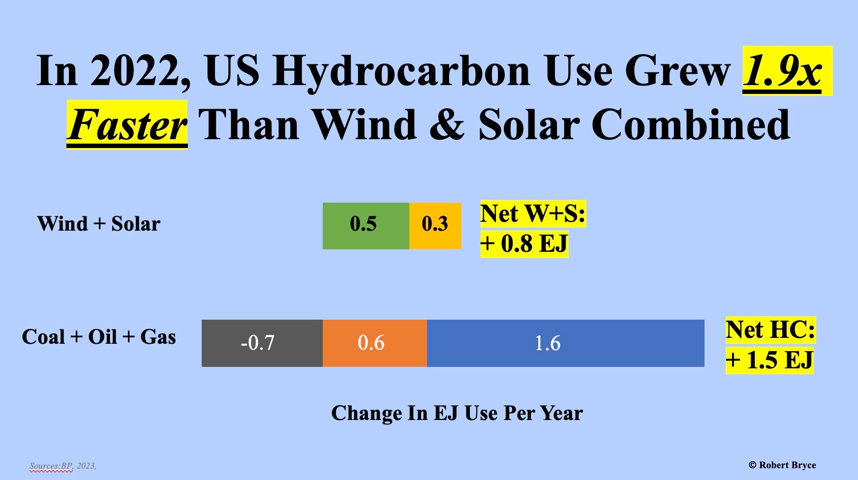

“Solar and wind are growing faster than fossil fuels” is both true and false at the exact same time. Schrödinger’s statistic. It’s true when you compare solar + wind’s internal growth rate to fossil fuel’s internal growth rate, but false if you compare absolute growth (as Robert Bryce did above).
If you didn’t unearth this, you might (incorrectly) conclude that solar and wind are replacing fossil fuels.
The good news is that we’re not telling you to become a tin-foil-hat-wearing-conspiracy-theorist every time you see a statistic. We’re just telling you to always assume that there is more to the story and to use your brain to dig in more.
Digging in past surface level statistics can be hard. But hey, doing literally anything is hard.
Thanks for using your brain to dig into this piece when you could’ve been doing literally anything else instead ☺️
The manipulation of data and language has been more destructive for humankind that "climate change". Numerous weather related events could have been prevented and prepared leading to a lot less property damage-which when measured correctly is benign to developed nations, but the point is it could be even lower-from wildfires, flooding, & tornados all based on the fact that the misrepresentation of data has lead to a misallocation of capital & resources which could have been use to for better mitigation efforts from weather damage & or food production.
When Texas experienced it's winter storm, their grid system collapsed because of of the non investment in baseload power cause the state to rely on renewables-which failed-& overload their natural gas system, which cause not only property damage but death. These are the types of situations we are finding ourselves in not because of climate change but because of the misrepresentation of data forces and plays to special interest, this is what we get. All less complete picture of the issues and missing the remedies that could alleviate our issues.